Three Birds, One Stone: Dynamic Image Transformations
Published by Scott Merical on
Nov 3, 2021 3:28:05 PM
Why do site speed, mobile usability, and SERP performance matter? It’s all about optimizing the digital experience. As ecommerce sites are built, business teams rightfully focus on functionality that impacts the bottom line. Beyond that, secondary features may arise such as branding, marketing, even analytics. But there are three items that deserve more airtime: site speed, mobile usability, and SERP performance. Luckily for our clients, Xngage considers all three during design and implementation of projects. Let’s dive in.
Site speed, mobile usability, and search engine rankings, each respectively can benefit from Dynamic Image Transformations used in ecommerce solutions. What exactly does that mean?
An ecommerce site will be consumed across multiple devices in today's connected mobile customer base, such as a desktop computer, tablet, or smart phone. Hence, the objective is to improve user experiences by ensuring that the bandwidth consumption, usability, and markup are all optimized based on whatever devices are used to access the website.
B2B buyers will tell you that finding products, securing inventory, and completing complex orders swiftly are key use cases depending on their role in the procurement process. An approach that optimizes websites and mobile sites for both website visitors as well as website designers is called Responsive Web Design. This approach allows the layout to adapt automatically (and flexibly) as a device screen resolution (i.e., viewport) changes. When implemented, responsive design utilizes fluid grids and media queries to target specific resolutions (or even different quality and content) to provide an optimal experience across devices. Most modern websites follow this approach and many vendor-offered ecommerce platforms ship with storefronts that follow this approach. However, there is more that contributes to mobile optimized experiences and that brings us to the topic of speed and performance.
Whenever images are included within those responsive pages/layout grids, images are embedded and will be transferred over the internet and onto the devices of users, only to then be right-sized on the device screen to fit the responsive page layout. This “image sizing in the browser” though, falls short when it comes to optimizing payload and speed. It, in fact, is insufficient. Instead, websites optimized for mobile, should be transferring images at the optimal resolution and size for the given viewport to reduce bandwidth and hence increase speed. This is where Dynamic Image Transformation comes into effect as it provides the technical underpinnings to deliver the right image at the correct size and format and quality. The same goes for video content by the way.
Xngage uses a best-in-class image rendition engine to deliver this capability in a technically superior way without requiring copious amounts of human resources to slice images by hand or have PIM systems pre-render hundreds of thumbnails. In addition, our solution saves clients a significant amount of time by streamlining digital asset management and image maintenance. Increasingly organizations are understanding the importance of rich product content, which requires multiple images per product that are managed and aggregated to offer customers multi-angle viewing options and more.
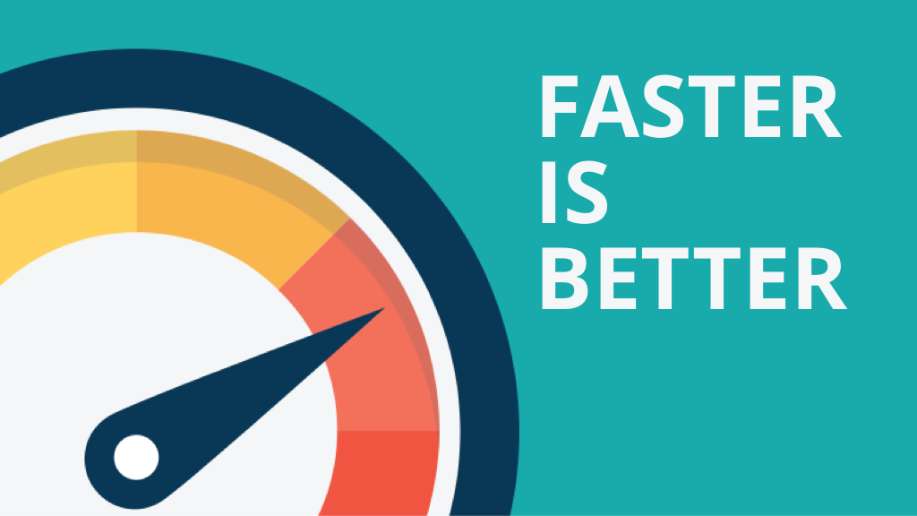
Let’s see how Dynamic Image Transformation impacts the first of the three birds: site speed, and in particular, page speed, the metric which matters most. Studies show that bounce rates increase, and conversion rates drop as overall page speed slows. According to LoadStorm, 1 in 4 visitors would abandon a website that takes more than 4 seconds to load. And micro-seconds matter: Deloitte reports that improving load time by 0.1 second can improve conversion rates by 8%! The biggest gains in speed come with smaller screens and newer browsers, as a smaller image will download more quickly on a page. Newer browsers also get a boost by using better compression algorithms. By example, Chrome/Edge browsers support webp, which offers 25-35% smaller file sizes, but that format isn't universally adopted - Safari/IOS does not support them. Hence the ability to target specific formats and sizes dynamically per device and browser is paramount.
Let’s look next at mobile usability, where the goal should be to easy and simply interact with your brand to facilitate a mobile-device purchase. Xngage supports creative design thinking (also known as art direction) through all mobile usability aspects, again leveraging Dynamic Image Transformation. If you are on a smartphone, you may be looking at an image optimally displayed on a desktop image but reduced in size maintaining the desktop aspect ratio. This is a problem. By not properly cropping the desktop image to the object of interest, it might cut off at the breakpoint and not even show the full product as you expected. In a mobile solution it is critical to specify the exact crop with a specific x/y coordinate to show a specific focus area of the image (or object within the image), or even display a completely different experience all together. Layouts may need to shift, or even hide sections to be optimal for mobile users in order to support an optimized customer experience. For example, imagine that a B2B digital commerce site displayed an exploded bill of materials for an assembly (cool feature!) where each replacement part within the assembly could be selected on the diagram and purchased. The desktop version of that feature would be very intuitive, but as it switched over to a 375 x 812 viewport (iPhone X), the display of that clickable bill of materials would need to be adjusted - otherwise it would be impossible to see the entire assembly, let alone click and purchase a replacement product within it! The page might also take a very long time to load on a phone if there were also a hi-res image of the assembly. Long load times and poor images kill conversions and with a little forethought are easy to fix.
Finally, while search engine rankings are based on several factors, page speed and other core metrics have long impacted SERP performance and must be managed from a technical point of view. This is specifically true with Google algorithms. The key takeaway for Dynamic Image Transformation for ranking is to ensure you have the right size and format for your images to improve core web vitals stemming from optimized payloads transmitted based on both the device and browser.
When considering any front-end changes as part of your next ecommerce project, make Dynamic Image Transformation part of your upfront dialogue and consideration. Take the time in the beginning to knock out all three - site speed, mobile usability, and SERP performance - and you will move even faster toward your end goal of creating business impact. At Xngage, we call this Digital Commerce Success, and we are here to help you achieve just that.
Related Articles
Create an Impactful and Results-Driven B2B Commerce Website
According to Business Wire Inc., the global B2B market is estimated to reach $20.9 trillion by...B2B Commerce Challenges - Product Data Management
Product Data Unification and Standardization - A critical process for successful B2B Commerce...
Ready to Chat?
Share your story - we would love to help!
Whether you are ready to send out an RFP or you are just starting your digital transformation journey, we are here to assist you.